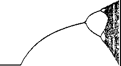
Forget about the initial population value (we'll leave it at 0.02). Just image varying the value of r, and recording the final value the system settles down out. You can start drawing a graph of the final population size for any given birth rate. Except, as you've seen, sometimes you get oscillations. That's okay, because you'll just get two (or four, or eight...) resting points for a single birth rate. And when you're in chaos you get lots and lots of "resting" points. The graph looks like this:
The first, steady part of the graph are those low values of r that settle down to a single final population. Then the first split is where we get period 2 oscillation: the oscillation grows (the high point gets higher and the low point gets lower), until each branch splits again). You can see the splits start coming faster, and then chaos. And then "quiet" periods in the middle.
![]()